My Architecture Projects at a Glance (3) | Best of Architech Studios
Important Disclaimer
The main purpose of publishing those kinds of projects is only informative and instructive. Because of the huge lack of references, notably in the Arab region that limits especially the Architecture academic students from doing their research, I hope these posts will bring some help where needed.
Furthermore, because of some old mentality that forbids their owners from bringing their projects to light due to their possession of the copyright of the material in question, as they said, in which I have serious doubts...
Finally, I hope that the general concept of the following projects will stay respected for its minimal levels; I hereby ban all kinds of copying and cloning, just for the general benefit, and as our Lord told us: "If you want to help someone teach him how to fish and don't give him a fish for just one meal instead".
I only allow the beneficial and positive inspiration of my designs in a way that leads at the end to a personal conception, which is my aim in posting this article and others in the series.
So please consider Inspiring not just Cloning!
The Partially-Designed Projects (Architectural Works)
Read more: Have a look at my two posts My Projects at a Glance (1) | Best of Architech Studios and My Projects at a Glance (2) | Best of Architech Studios, as it is the first and second parts of the series: The Best of Architech Studios.
After this foreword, let us enter the best projects my office/agency partially contributed to the design, but because there are so many, I will choose only the best and the most convenient ones to shorten my list as much as possible.
— Project No. 1
I was given the following plan layout (shown in Fig. 1 below) related to a current floor plan of a housing + commercial building. Even though the construction was almost finished at the time, the client still wasn't completely satisfied with the result, and it is clear why!
Let us make a brief critique of Fig. 1 and what is inside: As we can see and notice in the first place, the terrible balcony extends all over the floor plan, along with the facade covering the two conjoined apartments.
We can imagine the sort of facade that will result from such a bad plan layout: it is similar to a plant or school corridor or narrow pathway that leads to different succeeding rooms that stack before each other in a boring way. (see fig.2 below)
Not surprising at all, because a Civil engineer cannot replace an Architect in his work, and the contrary goes also; A popular mistake that we are still suffering from in our Arab region in general.
Of course, the designer didn't forget to put the separation between the two apartments, but apparently, he ignored all that is related to a good architectural conception.
 |
| Fig.1- The original layout of the current floor before being modified later, Photo Source: 101ArchiTech Archive |
 |
| Fig.2- The initial conception of the project: a total ignorance of the simplest and primitive regulations for managing an elevation the right way, and I apologize for this piece of crap! |
The mission that I was entrusted with consisted of somehow rehabilitation of the plan layout in a way to kill that feeling of entering a long pathway that traverses the apartment from its entrance to the last of the rooms that stack like classrooms along both sides.
- The effective Entrance Area should be very distinguished from the other area that leads to the bedroom or the private area in the home. (Area 1)
- The transfer Area to the bedrooms' privacy. This area can feature built-in closets needed for storing various household linens and other useful stuff, therefore limiting the wasted spaces in general. (Area 2)
 |
| Fig.3- The proposed layout plan with the necessary modification, Photo Source: 101ArchiTech Archive |
As you can see, the general layout is now more flexible and functional than before; The huge and unnecessary long balcony is divided into smaller balconies with full respect for the privacy of each apartment which is a must: you can now access the bedrooms' balcony without getting worried from being monetized from the reception area.
That is the first benefit revealed and gained from the owner which was totally understandable for the fact described above.
We still have the second part of the mission which is the exterior elevations. Since we did solve the plan layout and almost all its issues, all the remaining tasks will be automatically fixed; A method that I always follow based on a good design must commence from the inside and then reach the outside.
 |
| Fig.4- The final conception rendered with the mental ray engine, Photo: 101ArchiTech Archive. All rights reserved © 2013 |
— Project No. 2
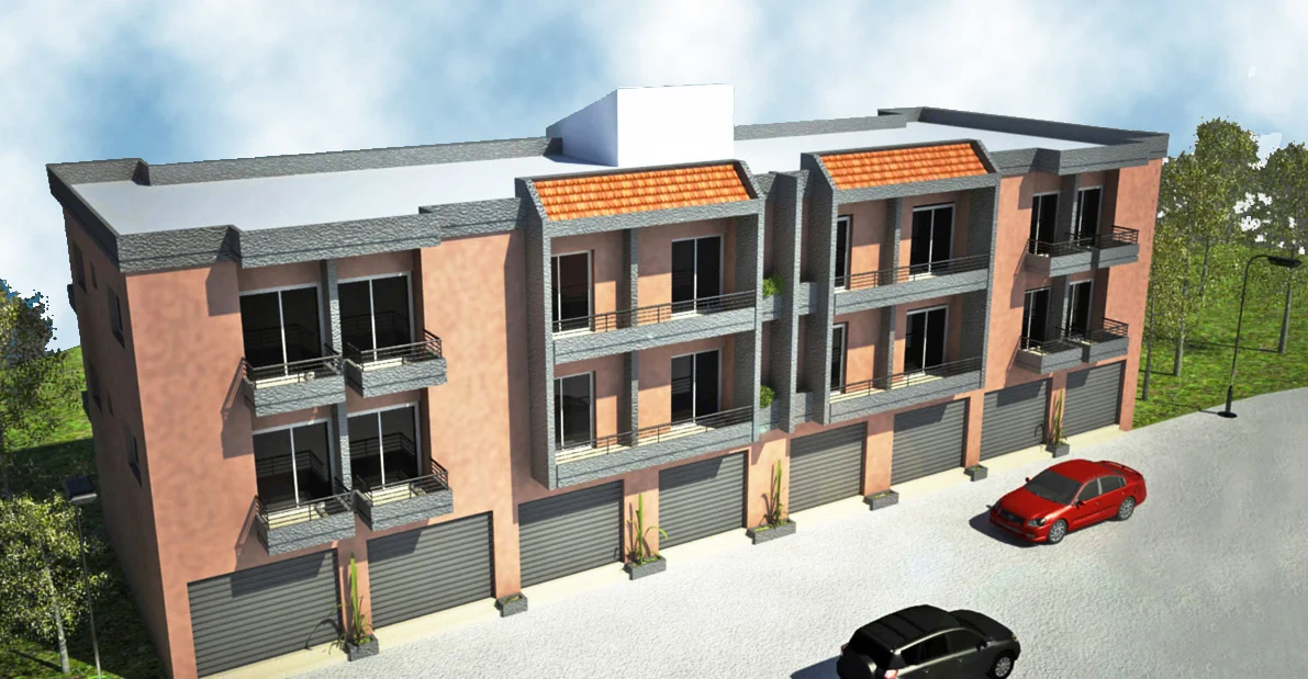
The next selected project in the review was compounded from four blocks, similar to each other: All I had to do is to model just one of them and then clone the others along in a straight line. A housing project and commercial retail at the ground level, this resort was somehow a first of its kind in its geographic location, where there are some restrictions for using material and architectural conception as well. It is located in the Northern Governorate of Lebanon, in Meriyata town.
As you can notice, the constraints were already here! Difficulties in adopting the relevant architectural treatment for the elevations and a big challenge to face within an environment that restrict the glazes openings and allows privacy in all its communities' activities.
 |
| Fig.5- The complex in a general view starting the street below, Photo: 101ArchiTech Archive, All rights reserved © 2013 |
Another wall stone cladding is to be used on the external parts of the building. The concept of this treatment takes into consideration the vitality of such a resort that includes all types of entertainment and services.
— Project No. 3
Images Grid Collection of the Project
Private Duplex Residential in Koura


Another Housing project in Koura, with two apartments by floor.— Project No. 4
— Project No. 5
 |
| View from the new dining room added to the existing extension |
 |
| View from the patio outside the extension |
 |
| View from the inside of the newly added extension block which includes the metal-covered pool and the related rooms |
.png)


